Solid-State Lighting for Illumination and Displays: Opportunities and Challenges for Color Excellence
Solid-State Lighting for Illumination and Displays: Opportunities and Challenges for Color Excellence
Solid-state light sources are transforming luminaires and information displays, enabling screens to illuminate rooms and luminaires to form images. Maintaining color excellence, from all perspectives, will be challenging but worthwhile.
by Lorne Whitehead
IT is interesting to compare the simple incandescent lamps that dominated the early days of lighting with today’s flat-screen televisions. TVs are impressive, but in two important ways the lowly incandescent lamp “outshines” them: first, incandescent lamps emit more than 10 lm of visible light for each
watt of electrical power, whereas a typical LED-illuminated LCD TV emits less than 1 lm. Second, incandescent lamps emit very high-color-quality light, yet most TVs emit light that has unacceptably poor color quality for illumination purposes. In short, today’s displays make for great televisions but terrible lamps! Some find this quite surprising since LEDs themselves are now much more efficient than incandescent lamps and they can be blended to make high-color-quality light.
Of course, some may feel this comparison is irrelevant because screens are rarely used for illumination, but that is bound to change. After all, for decades, screens have become cheaper, brighter, larger, clearer, and more commonplace and that trend is certainly continuing. We can anticipate that image displays will soon start making significant contributions to general illumination, similar to the way windows contribute significantly to indoor illumination while also making rooms more interesting. Another way to think of this is that we should reasonably expect our electric light sources to provide more than just light – why shouldn’t they also provide the added value of visual information?
As the blending of illumination and information display gets under way, society will face some important human-factors issues involving color perception. These relate to the spectral power distribution (SPD) of light and its impact on the accuracy and range of color reproduction in displays, as well as the color-rendering quality and photo-biological influences of the light emitted by displays. As it becomes practical to produce light with almost any desired SPD, designers
will have the freedom to adjust these factors, but in doing so they will face design trade-offs because what is best from one perspective is often not best from another. Often the parties influencing an overall design may have differing views of the relative importance of these factors. For this reason, it is important to achieve a shared understanding of them. Lighting designers and display designers will need to coordinate closely for optimal success as their areas of work begin to overlap.
The purpose of this article is to make a contribution toward that shared understanding. It provides an overview of the key design factors in both fields and suggests that soon there may be improved solutions for optimally satisfying all of the main requirements.
The Significance of Solid-State Lighting
By now, people are well aware that solid-state lighting devices, such as light-emitting diodes (LEDs) and organic light-emitting diodes (OLEDs), are a revolutionary addition to the field of lighting. A common assumption is that their primary distinguishing feature is high efficiency. But while these devices are indeed efficient, they do not dramatically surpass the efficiency of previous sources such as high-intensity discharge and mercury fluorescent lamps. The characteristic of LEDs that may be the most transformative is their ability to efficiently produce light in a narrow band of wavelengths and for the center of that output band to be selectable, during manufacture, at almost any desired points in the visible spectrum. As a result, it is possible to combine the light from a number of LEDs to
produce almost any desired SPD. For the first time, engineers have spectral design freedom. Here, it is argued that they also have a responsibility to exercise this freedom wisely.
Figure 1 shows an SPD for each of three light sources: a typical non-LED lamp (a fluorescent lamp that contains numerous peaks associated with the underlying mercury- vapor discharge) and two quite different LED lamps. Note that the vertical axis in Fig. 1 is dimensionless because the curves in this figure depict, for each lamp, the
ratio of the light intensity at each wavelength to the peak value, which, by definition, is 1.0. In order to explore the key perceptual phenomena arising from a very wide choice of SPDs, it will first be helpful to review some basic concepts of human color vision.
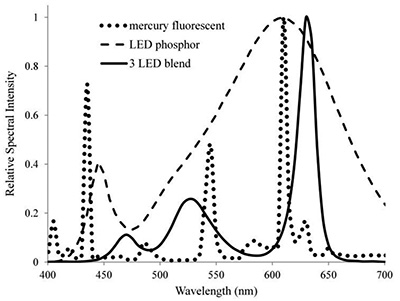
Fig. 1: Shown are spectral power distribution (SPDs) for a mercury fluorescent lamp, a white phosphor LED, and a lamp that blends three narrow-band LEDs.
Key Characteristics of Human Color Vision
In human color vision, wavelength information concerning light is detected by means of three types of light-sensitive retinal cone cells (labeled L, M, and
S), which have peak wavelength sensitivities in, respectively, longer, medium, and shorter wavelength regions of the visible spectrum. Their sensitivity functions are shown in Fig. 2.
It is important to note that the response functions shown in Fig. 2 are relative. One way to think of this is that if a certain degree of stimulation of a particular cone cell is produced by one unit of radiant power at that cone’s wavelength of peak sensitivity, then two units of radiant power would be required to produce the same stimulation using a radiation wavelength for which that cone sensitivity is half of its peak value. When calculating a cone’s response to light consisting of a blend of wavelengths, the radiant power at each wavelength must be multiplied by the cone’s sensitivity at the same wavelength and so these individual contributions can then be added up. Thus, the response of each cone contains no information about specific wavelengths that caused its stimulation; color information is known to the visual system only by means of the relative degree of stimulation of the three cone types. For example, longer-wavelength light will stimulate the L cones to a greater degree than the M or S cones because L cones have greater sensitivity at longer wavelengths than do the M or S cones. In turn, this pattern of cone stimulation (which creates the sensation of red light) indicates that the stimulus must have consisted of predominantly longer-wavelength light.
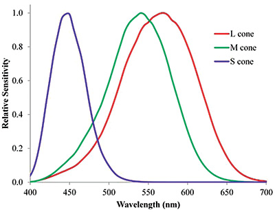
Fig. 2: The relative spectral sensitivity functions for the L, M, and S retinal cone cells appear in red, green, and blue, respectively.
Overall, this means that the brain can obtain information about the spectral distribution of light by observing the pattern of stimulation of the three cone cell types. Interestingly, this need to assess the intensity of cone stimulation is somewhat problematic because of the very wide range of lighting conditions that the eye routinely encounters. In rough terms, the intensity range over which color vision operates spans a factor of 1,000,0001 (from sunlight to moonlight). However, the optic nerve (a bundle of nerve cells that carry information from
the eye’s retina to the brain) can only convey a limited number of signal levels. The number of discernable signal levels probably depends on the kind of optical information being transmitted and is not precisely known, but there are clues that can provide a rough idea.
One of these clues is that, as recognized by typical reference books of sample colors,2 there are only about 40 distinguishable hues around the color circle. The exact number is not critical to the following comparison: Using 40 levels as an example, if one attempted to evenly represent the required million-fold range of intensity in just 40 equal ratiometric steps, each of those steps would represent about a 40% intensity change. But the typical just-noticeable difference in light intensities is actually a lot less – often on the order of 8% for shades of gray, and in certain cases of color perception as little as a 1% difference in relative cone stimulation may be noticeable.3
Clearly, this sensitivity would not be possible if the intensity of cone stimulation was directly communicated by the optic nerve, and yet the color-vision system does exhibit this high sensitivity over most of the million-fold range of illumination intensity previously mentioned. This remarkable perception accuracy is achieved through sophisticated signal processing, beginning with adaptive non-linear compression within the cones4 followed by sophisticated signal processing in the retina.5
Furthermore, after the resultant processed information is received by the brain, even more complex processing takes place6 providing to our conscious awareness a remarkably stable and reliable depiction of color information. The last processing stages are so important that some say we “see” mainly with our brain,7 not our eyes. In other words, what we consciously perceive is an image generated by a massive computer (the brain), based upon many factors, including information from the eyes about how objects in the world are influencing the incident light field.
Fortunately, in this article, it is not necessary to fully describe this remarkable perception process and indeed that is not even completely possible since there are still a number of unanswered questions. The primary point here is that color vision is an extremely sophisticated system. In evolution, sophisticated systems develop when they enhance survival over vast time periods8. In modern times, people generally greatly value aspects of life that were necessary for survival, such as health and fitness, good food, and security. From this perspective, it makes sense that the beauty and subtlety of color perception is very important to many people, and this is further evidenced by the vast color-related businesses in paints, dyes, fabric, cosmetics, industrial design, and marketing. Therefore, it is very important to maintain high color quality both in information displays and interior illumination, and it stands to reason this will matter even more as the two fields begin to overlap.
Studies of how people use color information have led to the realization that color vision serves two purposes that are related but different. In the first, people perceive color as an informative property of light.9 In the second, people perceive color as an informative property of the manner in which a surface reflects light10 (a distinction that will be made clearer shortly).
We’ll begin with the first – assessing the color of light. Not only is it the simpler of the two, but also it is a building block for the
perception of surface color. Figure 3 shows symbolically how the eye assesses the color of light landing on the retina.
The top row in Fig. 3 is simply an arbitrarily selected SPD; it is a graph of spectral power intensity vs. wavelength, which is useful information. For example, moonlight and firelight have quite different spectral distributions, as do a clear and cloudy sky. Therefore, information about the intensity and spectral distribution of a light could help a person determine the source that emitted it. The same can be true in the human-made environment. For example, we are familiar with the idea that a red traffic light is a universal symbol for “Danger! Stop!” The visual system can recognize a red light through the corresponding heightened stimulation of L cones, which are the most sensitive to the long wavelengths associated with the color red.
The next row in Fig. 3 shows the L, M, and S cone responses while the remaining rows depict the way they are effectively multiplied by the light SPD, and the results, summed to give the resultant L, M, and S values for the SPD in question, are shown in the last row. (The numbers shown are real – they were calculated using this procedure with the SPD shown and the L,M,S sensitivity functions, a process that is repeated in Figs. 4 and 5.) The numerical values show roughly how closely the light-source spectrum matches the sensitivity function for the L, M, and S cones. Sources with predominantly longer wavelengths stimulate the L cones the most, while predominantly shorter wavelengths stimulate the S cones most.
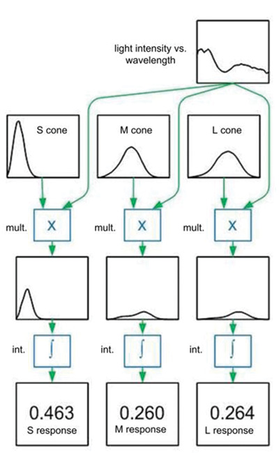
Fig. 3: The stimulation of the S, M, and L cones is determined by spectral power distribution (SPD).
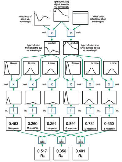
Fig. 4: Surface color is determined by comparing the S, M, and L cone stimulations arising from light reflected from an object of interest to the S, M, and L cone stimulations arising from light reflected by a white surface, when both the object of interest and the white surface are illuminated by the same light source.
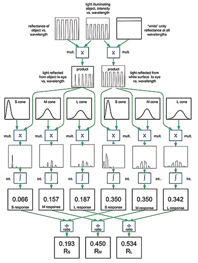
Fig. 5: The schematic represents an extreme case of poor color rendering in which a white source illuminates a normally gray surface and causes it to appear orange.
Since we only have three cone types, this information is only approximate, but nevertheless it can be very useful in distinguishing between different light sources. (It should also be noted that the raw L, M, and S values shown here represent information at the beginning of the signal-processing stages mentioned earlier, and the subsequent stages leading to what we actually perceive are more complex, but fortunately not needed for the present discussion.)
While information about light-source color is useful, that is not the most important, nor the most sophisticated use of color vision. Color vision’s second purpose, the assessment of surface color, is depicted in Fig. 4. (Do not worry if you find Figs. 4 and 5 too complex to easily follow in detail – just getting the gist of them will enable you to easily follow the remainder of this article.)
The main point in Fig. 4 is that surface color perception involves two separate assessments of light color that happen at the same time. The left half of Fig. 4 is concerned with light reflecting toward the eye from a surface of interest, and the right half is concerned with light reflecting toward the eye from a white surface. Importantly, both surfaces are illuminated by the same light source, depicted as the SPD shown at the top center of the figure. On both sides of the figure, the SPD of the reflected light is the product of the surface reflectance at each wavelength multiplied by the source intensity at that wavelength, and the color of that reflected light is then assessed, resulting in the listed L, M, and S values. That is, on the left we have L, M, and S values for the surface of interest and on the right side the larger L, M, and S values for the white surface.
The last two rows of Fig. 4 show the unique and important characteristic of surface color perception: The L, M, and S values for the surface of interest are divided by, respectively, the L, M, and S values for the white surface, yielding effective reflectance
values weighted by the L, M, and S sensitivity functions. (It should be pointed out that, in general, the processing is not nearly as simple as depicted here, but this simple division calculation is often a good approximation and is sufficient for the purposes of this article.)
The process of effectively referencing the color of a surface to the color of the illuminant is called chromatic adaptation, and it is very important because it provides reliable determination of surface color, somewhat independent of the color of the illumination. For example, people can accurately judge the ripeness of a banana, based on its color, when it is illuminated by daylight or by incandescent light. Even though the color of the incandescent light is pale orange in comparison to daylight, the perceived subtle shades associated with a ripening banana are not substantially changed. Without the sophistication of chromatic adaptation, the accuracy and reliability of our perception of surface color would be severely diminished.
In turn, diminished color-perception accuracy would be problematic because accurate assessment of surface color is useful – it gives us information about spectral reflectance function of the surfaces around us. That is, over large portions of the visible spectrum, we can estimate roughly what fraction of the incident illumination is reflected by an object, and this can then tell us about the materials that are present within the object’s surface. For example, the spectral reflectance function of human skin is affected by degree of oxygenation of hemoglobin molecules, which relates to health.11 Similarly, such information can help us know if various foods are fresh.
The reason for distinguishing between the assessment of light color and surface color is that they depend in very different ways on the SPD of light, which, in
turn, places different constraints on color excellence in displays and in illumination. Let’s now consider these relationships, first for the case of illumination and then for displays.
Color-Perception Quality Issues with Illumination
Since color perception evolved with daylight as the dominant source of illumination, and daylight remains unchanged and universally available today, it makes sense that people prefer to have artificial lighting provide the same color appearances that we see under daylight. This requirement is not terribly constraining because daylight itself comes in a wide variety of SPDs. Generally, all of these different daylight SPDs have the common characteristic of a fairly smoothly varying SPD. In some cases, there is a relatively smaller intensity at longer wavelengths (as with illumination from blue sky) and in others relatively more (as with sunlight near sunrise or sunset), yet in both cases white objects look white and the appearance of other objects appear consistent and natural, largely as a result of the chromatic adaptation taking place within the visual system.
Let us now consider a very important concept known as color rendering. To help understand it, we’ll consider an example of a source SPD under which colors can appear extremely distorted. Consider Fig. 5, which is almost identical to Fig. 4, showing the observation of a surface color. The only change is that a special SPD has been selected for the light source, and also a different special function has been selected for the spectral reflectance function of the object of interest. In both cases, the function alternates from high to low as a function of wavelength, which is unusual but possible.
The light source shown in the top row appears white (because it stimulates the L, M, and S cones approximately equally), and the surface represented here, when illuminated by daylight, would appear gray (because in that case its reflected light stimulates the L, M, and S cones equally). However, the simple arrangement in Fig. 5 has a perplexing outcome: When this particular white light shines on this particular gray surface, it appears orange! (This can be seen in Fig. 5, where the bottom-row ratios RS, RM, and RL correspond to those normally found for an orange surface color.) This is because both the source SPD and the surface spectral reflectance
function have narrow features in the wavelength dimension that interact, via the reflection process, in a way that distorts surface color. This is an extreme case, but many common electric lamps cause smaller, but still unpleasant, distortions of surface color. As real life examples, some popular energy-efficient lamps make tomatoes seem pale, while purple petunias appear blue.
Overall, there are two desirable features of natural illumination that we would like to preserve indoors. First, surface colors indoors should appear similar to their natural color outdoors. Second, if two objects have matching surface color under natural illumination, they should also have matching surface color indoors. This reliability gives meaning to the idea of surface color; it enables people to consider the precise shade of surface color to be a property of a surface. Therefore, we should try to minimize surface color distortion. Light sources that fulfill this requirement are said to have high color rendering.13 This idea is quantified by the CIE Color Rendering Index.14
So, how do LEDs impact color rendering? Well, on the positive side, the spectral design freedom provided by solid-state lighting makes it fairly easy to produce smoothly varying SPDs that do not distort color, and so it would seem reasonable, going forward, to expect no further problems with color rendering. Ironically, the opposite is the case, as a result of a simplistic response to a fundamental trade-off between color quality and luminous efficacy. To help explain this, consider Fig. 6, which shows the overall light sensitivity of the human color-vision system,
showing a peak response at 555 nm and a smooth fall-off to either side.
The average luminous efficacy of a lamp will be greater if its SPD has more of its energy close to the peak of Fig. 6. Put the other way around, an SPD will have less average luminous efficacy if a significant portion of its intensity lies near the ends of the distribution. Unfortunately, that is what is needed for high color-rendering quality. In other words, in designing a lamp’s SPD, we are forced to choose between producing more visible light or higher color quality; we cannot maximize both at the same time. Fortunately, this turns out to be a very mild tradeoff – in most practical cases only a 10% reduction in luminous efficacy is needed to maintain reasonably high color quality. And, importantly, this requires no power increase; the power can be kept constant while reducing the illuminance by 10% – a decrease that is essentially imperceptible – while providing an improvement in color quality that is very noticeable. Once this trade-off is properly understood, it is clear that color rendering can take priority without any negative consequences. High-color-rendering light is simply better for people, overall. Nevertheless lighting color quality is currently threatened by the widespread misunderstanding of the relative importance of luminous efficacy and color rendering.15
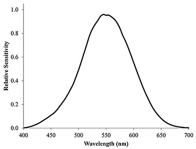
Fig. 6: Depicted is the the photopic luminous-efficacy function.
A related issue is that the current method for assessing color rendering (the aforementioned CIE Color Rendering Index) has certain inaccuracies when rating narrow-band light sources.16 Fortunately, a new improvement for that metric is under development by the CIE17 and is expected to overcome that difficulty. This will be helpful because phosphor-free narrow-band LEDs have the potential to be the most efficient light sources, and achieving high color rendering with them will require accurate design.
Another critical requirement for high-color-quality lighting is the avoidance of undesirable color variations between the various sources illuminating a room. Between rooms, people are comfortable with a range of lighting conditions (just as daylight comes in a range of colors), but within a given room even small color differences can distort the color appearance of objects, so such variations should be avoided.
Lastly, for completeness, it is important to bear in mind another quality factor that is not directly color related but that does influence the best choices for LED lamp design. This is the topic of the photo-biological impact of light. In the human retina, there is an important recently discovered class of photoreceptors known as intrinsically photosensitive retinal ganglion cells (IPRGCs). They have been shown to send signals to the brain that do not directly cause visible sensation but which influence the diameter of the eye’s pupil18 and have also been linked to reduction of seasonal affective disorder and synchronization of circadian rhythm.19 Recently, significant circadian rhythm disturbances have been observed to result from late-night use of e-Readers20 with backlighting. The IPRGC relative spectral sensitivity function has a similar shape to that of cone cells, with a peak response located between those of the M and S cones. Given these important effects, it would seem wise to ensure that the relative
amount of IPRGC stimulation approximately match what is normally found in daylight during the day and what is found in dim incandescent sources during the evening. Generally, this will be the case for fairly uniform spectral distributions, but it will require careful design consideration when working with narrow-band
LEDs.
Color-Perception Quality Issues with Information Displays
Let us now consider how the principles of color vision influence the design of displays. Color reproduction has been practical for a long time because of a key
simplification arising from the fact that we only have three types of cone cells. Two SPDs that cause the same level of stimulation of the three cone cell types
will have the same color appearance, even though they may have very different intensities at various wavelengths. (In this case, the SPDs are described as metameric.) Generally, the overall shapes of metameric SPDs are somewhat similar, but at a detailed level they may be very different. Because there are only three cone cell types, it follows that for most SPDs, an SPD of matching color appearance can be generated by adding together a selected amount of three so-called “primary” SPDs. Typically in information displays, the three primaries used appear red, green, and blue.
From this perspective, a convenient way to characterize any given SPD is by the relative degree to which they excite the three cones. Generally, these can be described by a pair of numbers that are determined from the ratios of the cone excitations, and there are many different ways to do that. Here, we will use the most common one – the familiar CIEx,y chromaticity coordinates,21 as shown in Fig. 7.
The curved envelope shown in Fig. 7 depicts the x,y chromaticity coordinates of all of the individual spectral wavelengths, ranging from about 400 nm at the bottom left to about 700 nm at the bottom right. Connecting the two ends of the spectral points is the so-called purple line segment, coordinates that can only be achieved by blending monochromatic blue light from one end with monochromatic red light from the other.
The primary significance of this diagram is as follows: Consider a first SPD that corresponds to a first point in the diagram and a second SPD that corresponds to a second point. Any mixture of the two distributions will correspond to a point in the diagram lying somewhere on the straight-line segment connecting the first point with the second point. Furthermore, if there is a third distribution corresponding to a third point, all mixtures of these three distributions will correspond to points located within the triangle formed by the three points. There are two key practical implications – first, the only possible coordinates are those lying in the colored region within Fig. 7. Second, most chromaticity coordinates can be made through mixtures of three primary stimuli, the first of which has chromaticity coordinates in the red region, the second in the green region, and the third in the blue. This is the standard well-known concept of additive color mixing as used in most electronic image displays.23
Less well-known are some key color-vision issues associated with the choice of additive primaries. One of these relates to the tradeoff between gamut and efficacy. The numbers shown within the colored region of Fig. 7 depict the maximum possible luminous efficacy of SPDs with that chromaticity coordinate, shown in lm/W. (These values were obtained by numerically optimizing a source SPD subject to
the constraint that it have the specified x,y coordinate.) The maximum possible efficacy is 683 lm/W, which occurs with monochromatic light with a wavelength of 555 nm and appears yellow. All other chromaticity coordinates have lower values, tending toward zero at the extreme red and blue ends of the spectrum.
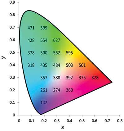
Fig. 7: This CIEx,y chromaticity diagram also shows the maximum possible luminous efficacy of radiation at selected x, y coordinates.
The net result is that there is a fundamental trade-off when selecting primary stimuli for color displays. On the one hand, we would like them to be as far as possible into the “corners,” so as to encompass the largest triangle of possible colors. (This is called the “gamut” of the display and generally it is felt that a larger “gamut area” is better because it allows a wider range of colors to be reproduced.) This forces us to use primaries that have low efficacy, thus wasting energy or sacrificing brightness, or both.
Another difficulty with wide-gamut displays is that they intensify natural differences between human observers. The L, M, and S cone response functions shown in Fig. 2 result mainly from special light-sensitive molecules that differ in the three
cone types but are the same in the great majority of people with normal color vision, which is why three primary systems work fairly well for most people. However, the eye has light transmission losses that modify the cone response functions to some degree, and these losses are more variable from one person to another and even over a person’s life.23 As a result, the accuracy with which a blend of primaries will match the appearance of a real scene varies somewhat from person to person, an effect sometimes called metameric error. It is not a large problem, but it can be bothersome, and, unfortunately, the severity of this problem grows with the gamut area of a display. Finally, from a practical point of view, it is more difficult to accurately reproduce subtle pastel colors if the underlying primaries are extremely vivid – greater control precision is then required. For these reasons, there has always been a tug of war involved in designing primary-color stimuli for information displays.
Finally, there is a new concern that relates to the image content that a wide-gamut display can show. In recent decades, researchers have learned that long-term adaptation mechanisms take place in the human-visual-perception system in response to exposure to extreme stimuli. For example, exposure to significant amounts of intense red light can distort the balance of red-green response of an observer, and this effect can persist for days or weeks.24 It is possible that similar adaptation could occur to exposure to extremely high-color-contrast stimuli, which would normally be extremely rare in ordinary life. The adaptation could take the form of reduced contrast sensitivity, meaning that day-to-day colors could appear less colorful after such exposure. In this sense, high-color-contrast displays could be habit forming. There could be troubling psychological consequences of such exposures, and we should be particularly wary of exposing children to excessive amounts of such stimuli. Now we can take a look at how these factors will become more important as the anticipated blending of information display and illumination proceeds.
Human-Factor Trade-Offs As Information Displays and Illumination Blend
As a concrete example, consider Fig. 8, showing a recent night-time photo of New York’s Times Square and a graph of the SPD of the ambient lighting.25
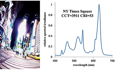
Fig. 8: In Times Square in New York City, most of the night-time light comes from displays. The chart at right shows the SPD and the CRI of the resulting ambient lighting.
That ambient lighting comes almost entirely from the surrounding LED video displays, and its Color Rendering Index is only 52, which is unacceptable for conventional lighting. Ironically, while the people shown on those screens appear in their natural color, the people illuminated by the screens may not.
It is apparent that the challenges of the existing lighting design trade-offs will worsen as displays become providers of light as well as imagery. The problems fall into three categories:
Gamut: The display industry push toward higher gamut will cause further problems as displays provide illumination because three-primary wide-gamut lighting has very poor color rendering, thus distorting the color appearance of familiar illuminated objects.
Color balance: Typically, the average chromaticity of the light produced by televisions is bluer than the usual values for indoor illumination. Unless handled well, this can cause color-appearance distortion even if the screen output light is intrinsically of high color quality. There will need to be reasonable limits on the size of the color difference between the light output of displays and ambient lighting.
Emotional and photo-biological effects: It is important to understand that color vision is one of the most sophisticated human senses and that our visual experiences, both conscious and unconscious, have a profound impact on our sense of well being. We do not yet have a good understanding of these issues, and this calls for caution. Pending greater understanding, we should at least minimize exposure to stimuli that differ dramatically from the sorts of visual conditions under which our eyes evolved. It is possible to produce impressive and dramatic color experiences with solid-state lighting, but their excessive use is unlikely to be good for people.
Conclusion and a Look to the Future: Six-Primary Displays?
When faced with difficult trade-offs, it is natural to ask if there can be a breakthrough that lets us have our cake and eat it too. Indeed, for some time an idea has been floating around the display industry that could be a major step forward – the use of a larger number of primaries.26 Fig. 9 depicts this idea conceptually within the x,y chromaticity diagram and through graphing the SPDs for a theoretical six-primary display system.
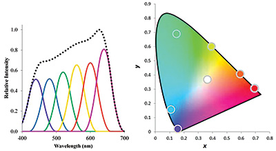
Fig. 9: Chromaticity coordinates and SPDs for a hypothetical six-primary-color display system are shown.
The primary reason that such displays have been proposed in the past is to achieve even greater gamut than can be achieved with any three-primary system. Any color can be produced that lies within the six-sided polygon defined by their six x,y coordinates. What has been less well appreciated, but is now becoming a strong driving force for this improvement, is the way in which this design overcomes the other key concerns that have been mentioned above. Unlike wide-gamut three-primary systems, the six-primary system ameliorates the following previously mentioned problems:
Efficacy: The inefficient deep-red and deep-blue primaries are responsible for a small portion of the light, so overall efficacy is excellent.
Metamerism: The deviations from viewer to viewer are very significantly reduced with this system because the typical SPDs are smoother, so more people will see better color most of the time.
Color rendering: The smooth spectral characteristics can yield excellent color-rendering properties without significantly reducing efficiency or gamut.
Looking toward the future, we now have much greater motivation to achieve all of these desirable outcomes simultaneously. Fortunately, it seems likely that color excellence, from all perspectives, can be practically maintained as the fields of illumination and image display gradually overlap.
References
1R. Shapley and C. Enroth-Cugell, “Visual adaptation and retinal gain controls,” Progress in retinal research (Elsevier, 1994).
2http://www.pantone.com/pages/products/product.aspx?pid=1351&ca=92, retrieved January 29, 2015.
3Wyszecki and Stiles, Color Science, 2nd edition (Wiley Classic Library Edition, 2000), p. 306.
4D. Endeman and M. Kamermans, “Cones perform a non-linear transformation on natural stimuli,”Journal of Physiology 588, 435–446 (February 1, 2010).
5M. D. Fairchild, Color Appearance Models, 2nd edition (John Wiley and Sons), p. 15.
6M. A. Webster and J. D. Mollon, “Change in colour and appearance following post-receptoral adaptation,” Nature 349, 235–238 (1991).
7L. Silverstein, personal communications (December 7, 2011).
8S. E. Palmer and K. B. Schloss, “An ecological valence theory of human color preference,” Proceedings of the National Academy of Science 107, 19, 8877–8882 (2010).
9M. D. Fairchild, Color Appearance Models, 2nd edition (John Wiley and Sons), p. 55.
10M. D. Fairchild, Color Appearance Models, 2nd edition (John Wiley and Sons), p. 183.
11A.Th. Schäfer, “Colour measurements of pallor mortis,” International Journal of Legal Medicine 113, 2, 81–83 (February 2000).
12C. R. Chen and H. S. Ramaswamy, “Color and Texture Change Kinetics in Ripening Bananas,” LWT – Food Science and Technology 35, 5, 415–419 (August 2002).
13K. Houser, M. Mossman, K. Smet, and L. Whitehead, “Tutorial: Color Rendering and Its Applications in Lighting,” LEUKOS, DOI:10.1080/15502724.2014.989802; published online: 21 Jan 2015.
14Commission Internationale de l’Eclairage (CIE), “Method of measuring and specifying colour rendering properties of light sources,” 1995, Vienna (Austria): CIE. Publication No. CIE 13.3-1995, p. 16.
15K. Papamichael, M. Siminovitch, J. Veitch, and L. Whitehead, “High Color Rendering Provides Better Color Without Requiring More Power,” LEUKOS (in press) (2015).
16K. Smet, J. Schanda, L. Whitehead, and R. Luo, “ CRI2012: A proposal for updating the CIE colour rendering index,” Lighting Res. Technol. 45(6), 689–709 (2013).
17Commission Internationale de l’Eclairage Technical Committee 1–90.
18M. Spitschan, S. Jain, D. Brainard, and G. Aguirre, “Opponent melanopsin and S-cone signals in the human pupillary light response,” www.pnas.org/cgi/doi/10.1073/pnas.1400942111
19G. Brainard D. Sliney, J. Hanifin, G. Glickman, B. Byrne, J. Greeson, S. Jasse,
E. Gerner, and M. Rollag, “Sensitivity of the Human Circadian System to Short-Wavelength (420-nm) Light,” J. Biol Rhythms 23, 5, 379–386 (October 2008).
20A. Changa, D. Aeschbacha, J. Duffy, and C. Czeisler, “Evening use of light-emitting e-readers negatively affects sleep, circadian
timing, and next-morning alertness,” PNAS 112, 4, 1232–1237; doi:10.1073/pnas.1418490112
21J. Schanda, Colorimetry: Understanding the CIE System (John Wiley and Sons, 2007), p. 34.
22http://www.huevaluechroma.com/044.php. D. Briggs, “The Dimensions of Color,” retrieved January 29, 2015.
23G. Johnson and M. Fairchild, “Full-Spectral Color Calculations in Realistic Image Synthesis,” IEEE Computer Society 19, 04, 47–53 (July/August 1999).
24J. Neitz, J. Carroll, Y. Yamauchi, M. Neitz, and D. Williams, “Color Perception Is Mediated by a Plastic Neural Mechanism that Is Adjustable in Adults,” Neuron 35, 4, 783–792 (15 August 2002).
25Spectroradiometer measurements recorded by Starr Davis, ARUP, New York, NY, personal correspondence (May 2, 2013).
26T. Ajito, T. Obi, M. Yamaguchi, and N. Ohyama, “Expanded color gamut reproduced by six-primary projection display,” Proc. SPIE 3954, Projection Displays 2000: Sixth in a Series, 130 (April 25, 2000). •
Lorne Whitehea is a Professor in the Department of Physics and Astronomy at the University of British Columbia located in Vancouver, Canada. He can be reached at lorne.whitehead@ubc.ca