PQM: A Quantitative Tool for Evaluating Decisions in Display Design
Display manufacturers must continually make decisions about device performance with regard to such characteristics as resolution, luminance, and color. 3M has developed a new tool that enables product developers to forecast how these design factors affect users’ perceptions of quality.
by Jennifer F. Schumacher, John Van Derlofske, Brian Stankiewicz, Dave Lamb, and Art Lathrop
DISPLAY DEVELOPERS now have extraordinary opportunities for advancing performance. They can create displays that approach the limits of human perception (in
resolution) and produce more than enough luminance in most cases. Displays can also offer a much larger color gamut – a performance characteristic that has lagged behind gains in resolution and luminance – thanks to new display architectures and technologies such as quantum dots and organic light-emitting diodes (OLEDs).
However, even though manufacturers have the technical capability to do so, most do not produce displays that provide the highest levels of resolution, luminance, and color gamut. (Similarly, automakers do not give every vehicle top-of-the-line horsepower and interior styling.) Instead, they might decide to moderate performance characteristics to meet consumers’ cost constraints. They recognize the consumers’ and regulators’ concerns about energy consumption. And they take advantage of consumers’ color and resolution expectations, which do not require a perfectly faithful representation of reality.
The impact of some of these tradeoffs can be calculated with relative ease. For example, if a product developer were considering a reduction in backlight performance resulting in reduced display luminance, the impact on display performance in exchange for cost savings could be measured using readily available tools. Potential improvements in energy consumption would also be easy to quantify.
Measuring the impact of display characteristics on consumers’ perceptions of quality is more difficult. It is harder still to gauge the change in consumers’ attitudes if a reduction in one performance attribute – luminance, for example – is accompanied by an improvement in another, such as color or resolution.
Large-scale consumer surveys could, in theory, provide the detailed information about consumer preferences that developers would like to have when considering tradeoffs; however, such research is expensive. Furthermore, research on consumer preferences is often useful for only short periods; key performance characteristics improve rapidly and consumer expectations change with them. (What was a desirable resolution in 2007 was subpar in 2010.) Not surprisingly, few large-scale studies of consumer preferences have been undertaken.
As an alternative, some researchers have pursued computational models of consumer preferences, such as P. G. J. Barten’s Square Root Integral (SQRI) metric. First published in 1987, the SQRI calculates expected viewer preferences for size, resolution, and luminance.1 SQRI’s value is limited, however, in that it does not consider color gamut and contrast.
Recently, the authors and other researchers at 3M developed the Perceptual Quality Metric (PQM), a new computational model based in part on the SQRI. The goal of this metric is to predict the subjective quality of a display, not the fidelity of the images rendered on it. PQM calculates expected viewer perceptions of quality based on viewing distance, display size, resolution, luminance, and color gamut. By using this tool, product developers can now quantify the perceptual quality
improvements in products based on changes in display specifications. These assessments can then be used to guide the inevitable tradeoffs that are made in display design or, more intriguingly, drive toward a display that achieves levels of perceived quality hereto unforeseen.
Metric Development
To develop the new metric, 3M conducted a series of experiments to determine subjects’ preferences for images displayed with varying luminance and color gamut
characteristics.
In the first experiment, 14 adult subjects (equally divided by gender) were shown a set of 10 images over multiple trials. The images were randomly generated shapes (triangles, squares, and circles) of various sizes and random colors (Fig. 1). The random shapes and colors were used as a context-independent condition where humans would have no expectations of color (“memory colors”).
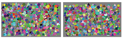
Fig. 1: Random shapes and colors were used to provide context-independent imagery for which viewers would have no preconceptions about what color the images should be.
In a second experiment, 24 adult subjects (equally divided by gender) viewed one image randomly selected from a set of five photo-graphs (Fig. 2). (Based on the first set of studies and the added complexity of and number of real images, additional subjects were warranted for statistical reliability.)

Fig. 2: Photographs were used as a context-dependent condition to simulate display use where subjects have an expected color.
Each subject viewed the same photo multiple times, with variances in color gamut and luminance. The photographs were used as a context-dependent condition to simulate display usage where objects such as the sky have an expected color; photos included multi-color and single-color (red, green, and blue) objects.
Each of the 15 stimuli was processed to simulate every possible combination of four gamut sizes and three luminance levels, for a total of 12 simulations for each photo and image.
In both experiments, subjects were seated 36 in. from two high-performance monitors, arranged side-by-side. For each stimulus, two variations (with different luminance and color) were presented simultaneously on the two monitors (one image per monitor) for 2 sec, after which white noise appeared until a preference was recorded. Every possible pairing was presented, including comparisons with identical characteristics. Additionally, to ensure that one monitor was not preferred over the other, each pairing was repeated with the images on the opposite monitor. Therefore, a total of 156 trials were given to each subject.
The data were used to obtain several computational models incorporating luminance and color-gamut area. A validation experiment was then conducted using 36 subjects (22 male). Subjects ranged in age categories from 20 to 60. Five color-gamut areas and four luminance levels were varied (creating 20 conditions) and subjects rated these display simulations for each of three images. The equation with the highest correlation to the validation data was selected as the final PQM.
Results: Multiple Routes
Initial results suggest that PQM is an accurate tool for forecasting how changes in color gamut, luminance, and resolution will affect viewers’ perceptions of quality, as measured by Just Noticeable Differences (JNDs). (One JND represents a difference between compared devices that is noticeable but does not have a large impact on preference; three JNDs represent a significant impact and 10 are substantial.) The validation experiment showed a correlation of 0.97 between predicted quality values and actual values.
The implications of this tool are significant. By graphing luminance and color gamut, for example, developers can readily predict the relative impact of performance improvements or reductions (Fig. 3) without investments in large and expensive studies of consumer preferences.
The graph shown in Fig. 3 reveals that improvements in luminance and color are both nonlinear, starting with sharp increases that gradually become less steep. Gains in luminance affect perceptions of quality, even as the display approaches 400 cd/m2, but between 200 and 300 cd/m2, the return on improvement begins to diminish substantially. Improvements in color gamut, however, result in continuous strong improvements in perceptual quality, up to 120% of the Adobe RGB standard.
It should be noted that this assessment addresses the effect of brightness on perceived quality under conventional indoor lighting (in this case, 310 lux of
overhead illumination). The results would obviously be affected by less favorable lighting conditions, such as a phone being used outdoors or a television being viewed in a bright room.
In general, PQM suggests that the highest luminance and a low color gamut will generate an acceptable quality value, but superior quality values are not
achievable without a higher color gamut. Color saturation can be used to maintain high values if the developer opts to lower another performance characteristic. For example, if a developer sought to improve a display’s energy efficiency by lowering luminance, the display’s quality value could be maintained (or even increased) by expanding the color gamut. As shown in Fig. 3, by increasing color gamut, excellent quality values can be achieved even at mid-range (250–300 cd/m2) luminance levels.
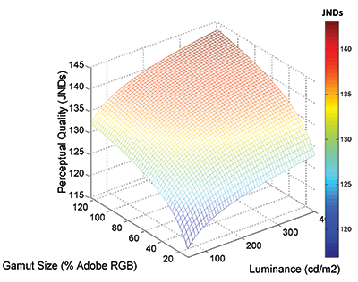
Fig. 3: The interaction of luminance and gamut area affects perceptual quality. A larger perceptual-quality value indicates higher preference. The display modeled is a 46-in. LCD TV with 1080p resolution and a viewing distance of 1.5x the display diagonal (69 in). With increases in color gamut or luminance, improvement in perceived quality is nonlinear.
Figure 4 demonstrates the interaction between gamut size and luminance for a 46-in. LCD TV with 1080p resolution at the recommended viewing distance of 1.5 times the display diagonal (69 in.). Note that the same JND score can be achieved with higher
color/lower luminance or lower color/higher luminance. As luminance drops from 350 to 280 cd/m2, perceived visual quality can be maintained by increasing the color gamut size from approximately 50% to 60%.
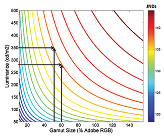
Fig. 4: Isoquality curves for display quality show the interaction between gamut size and luminance. The display modeled is a 46-in. LCD TV with 1080p resolution and a viewing distance of 1.5x the display diagonal (69 in.). The same JND score can be achieved with higher color/lower luminance or lower color/higher luminance.
Figure 5 illustrates how these tradeoffs could apply in actual devices with considerable variations in performance attributes. In this example, five models are analyzed using PQM: the first three models represent first-generation devices, while the others represent second-generation models with better resolution. Models within each generation have significant differences in luminance and color gamut, but they achieve similar PQM values. The second-generation devices are particularly instructive. Here, the “D” and “E” devices attain the same PQM value with significantly different luminance and color gamut specifications.
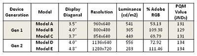
Fig. 5: As this comparison of devices demonstrates, similar perceptual quality values can be attained via different display specifications.
PQM can also reveal when additional improvements in a performance attribute will produce little or no change in consumer perceptions of quality, when the attribute has been “maxed out.” For example, PQM analysis indicates that significant gains in the perception of quality can be achieved by upgrading resolution from 1080p to 4K. This was especially true when the display size increased and the viewing distance was held constant. The predicted benefit from upgrading to 8K was negligible, however, even for the 65-in. display. See, “PQM in Action: Is 4K Resolution Worth the Cost?”
Impact on Color Management and Content
PQM does not necessarily encourage the use of larger color gamuts. However, it does demonstrate that – if resolution and luminance are held constant – larger color gamuts will improve the perceived quality of the majority of consumer displays. It also suggests that higher gamuts can compensate for decreases in other performance attributes (such as luminance and resolution).
The authors believe that this demonstration of the power of color, combined with new enabling technologies (such as quantum dots), will lead to more displays that have the ability to express a larger color gamut.
This, in turn, will have repercussions for the display industry; two consequences seem obvious. First, a renewed emphasis on color management is likely. For years, many operating systems and programs have had insufficient or poorly implemented color management. Instead of interpreting the display’s color capabilities, these systems and programs have simply assumed that the display is capable of expressing colors that correspond to the sRGB gamut. Often, this generates images with undersaturated or skewed colors – a problem in any case but especially on retail websites where the images do not match the actual products. The weakness of this approach is exaggerated with high-gamut displays or with gamuts that are not approximately the same shape as sRGB. As higher gamut displays become increasingly common due to the continued growth of OLED and the emergence of quantum-dot-enabled LCDs, well-executed color management at the systems level becomes that much more critical.
Second, a heightened color gamut could influence content. Once content providers have the ability to use expansive color, they will be inclined to use it. Intuitively, one recognizes that heightened color is preferable to a lower gamut. Initial research confirms this. A pilot eye-tracking research project by 3M suggests that content with a higher color gamut receives more attention (as measured by aggregated fixation or dwell time) than content with a lower color gamut. (See “Supplementing PQM.”) This wider color gamut content could then make narrow gamut displays look even worse because the color encoding of the images is less saturated. For example, DCI-P3 content will not look as good on a 45% NTSC notebook as sRGB if color management is ignored.
This is not to say that content providers will feel compelled to use a wide color gamut – or color at all – in every circumstance. (Any art director who does not appreciate the power of black and white imagery should be compelled to study Walker Evans and re-watch Casablanca.) But once the tool of a higher color gamut is available, it will be used.
Additional impacts should become obvious as the model is refined and extended. Over the coming year, for example, the authors plan to expand the model by adding a measure of contrast. Further improvements could include accounting for the impact of changing specific gamut primaries as opposed to overall gamut size and a validation of the model for outdoor use and for video and animation. As of this writing, 3M is evaluating how to make PQM available to its partners and customers, as well as to the broader display industry.
References
1P. G. J. Barten, “The SQRI method: A new method for the evaluation of visible resolution on a display.” Proc. SID 28, 253–262 (1987).
2“The truth is, as nice as these TVs are, you probably will not see much difference. A 60-in. 4K will not look dramatically better than the 1080p TV you have in your home right now unless you shove your nose up against the screen. The average person’s eyes cannot see the difference when sitting 10 ft. away from a 60-in. TV.” http://www.wired.com/ gadgetlab/2013/01/the-4k-push-ces-2013/
3See, also, “Why Ultra HD 4K TVs are still stupid,”
http://reviews.cnet.com/8301-33199_7-57566079-221/why-ultra-hd-4k-tvs-are-still-stupid/ •
|
PQM in Action: Is 4K Resolution Worth the Cost?
The value of PQM is not just in assessing tradeoffs (i.e., the impact of improving one performance characteristic while constraining another). It can also reveal when an improvement will produce little or no change in the consumer’s perception of quality – when the benefit is “maxed out.”
The latest models of ultra-high-resolution LCD televisions – so-called 4K sets – provide a good case in point. Objectively, the displays are a significant improvement; current HD sets with 1080p have one-quarter the resolution of the 4K sets. However, some reviewers have questioned whether that much higher resolution would translate to a meaningful increase in consumers’ perception of quality.2,3
Based on PQM, the short answer is yes, especially among the largest displays, but the effect diminishes quickly after 4K (making 8K resolution a less attractive improvement). At a viewing distance of 9 ft., PQM analysis predicts that on any display of 32 in. or more, the improvement from 720p to 1080p results in a meaningful improvement in perceived quality (Fig. 6). On 42-in. and larger displays, the improvement from 1080p to 4K resolution creates a meaningful difference in perceived quality; the difference is dramatic for sets that are 55 in. and larger.
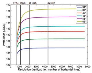
Fig. 6: At 300 cd/m2 and a viewing distance of 9 ft., calculated improvement from 1080p to 4K creates a strong increase in perceptual quality of larger TVs. Improving resolution from 4K to 8K creates a measureable but much less powerful increase in perceptual quality.
At shorter distances (at the recommended viewing distance of 1.5 times the screen’s diagonal), the improvement from 1080p to 4K also creates a strong increase in perceived quality (Fig. 7). At either range (9 ft. or 1.5 times the diagonal), there is a measureable but considerably less powerful increase in perceived quality when the resolution improves from 4K to 8K.
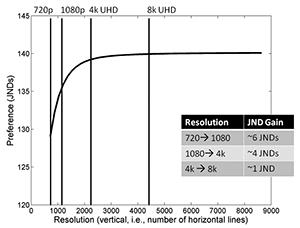
Fig. 7: At the recommended viewing distance (1.5 times the display’s diagonal), the improvement from 1080p to 4K creates a strong increase in perceived quality. There is a measureable but considerably less powerful increase in perceived quality when the resolution improves from 4K to 8K.
Obviously, the introduction of displays with ultra-high resolution raises issues about content and infrastructure (specifically, the bandwidth necessary to allow video streaming). PQM does not address these important considerations. That said, product developers might find some value in the metric’s analysis, which oncludes that ultra-high resolution does appear to improve consumers’ perceptions of quality, up to about 4K, especially on larger (42-in. and above) displays.
|
|
Supplementing PQM
PQM demonstrates how product developers can manage perceptions of quality as they alter performance characteristics. Final decisions on how those performance characteristics should be configured will usually be determined by the cost or technical capabilities of the manufacturer. And in some instances, the application – how and where the display will be used – can provide additional information that can supplement the PQM analysis and guide the configuration of luminance, color, size, and resolution.
This is particularly the case when the display is presented in a retail or other environment where viewer attention is crucial. Here, initial research shows, a display with a wider color gamut will receive more attention than a lower color gamut display.
In a pilot study conducted by 3M, five subjects were shown nine colored images. Each image was manipulated to produce four different color gamuts: standard RGB
(sRGB), saturated green, saturated red, and saturated red and green. The four color gamuts for each image were displayed simultaneously for 1–3 sec to avoid scanning heuristics; placements were also varied to eliminate location artifacts.
Subjects’ eye movements were tracked and the time of fixation on each image was aggregated. During the 3-sec trial, as shown in Fig. 8, subjects fixated on the saturated green and saturated red and green images longer than the sRGB images. (Results of the one-second presentation showed a similar pattern in mean fixation duration.)
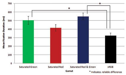
Fig. 8: During a 3-sec trial, subjects fixated on the saturated green and saturated red and green images longer than the sRGB images.
Given the sample size, it is difficult to draw detailed conclusions on the interaction between specific images and color gamuts. Also, the device used in this pilot study had a red primary that was only slightly more saturated than the sRGB standard, which likely had a negative impact on the “Saturated Red” test case.
Despite these limitations, the study has implications for product developers. It suggests, for example, that the perception of quality should not be the sole
consideration when designing a display for use in digital signage. A display with a high color gamut will attract more attention (as reflected in longer fixation times) than a display with a lower color gamut. Likewise, the relationship between attention and color saturation should be considered by content developers as they choose the icons and images used in retail displays.
The authors are currently considering additional research, using a larger sample and more capable devices, which will be able to draw more detailed conclusions
on the relationship between fixation time and color gamut.
|
Jennifer F. Schumacher and Brian Stankiewicz are with 3M Company’s Software, Electronics, and Mechanical Systems Laboratory. John Van Derlofske, Dave Lamb, and Art Lathrop are with 3M Company’s Optical Systems Division. They can be reached through 3M’s website at www.3m.com/displayfilms.